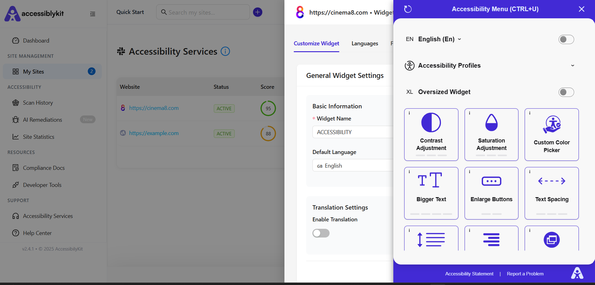
Appearance Settings
Adjust colors, size and icon of the widget toggle to fit your brand and improve visibility.

Button Color Mode
SOLID for one consistent color, or GRADIENT for a smooth two-color transition.
Primary & Secondary Colors
-
Primary Color
Your button’s main hex color. -
Secondary Color (Gradient only)
Accent color for the gradient effect.
Gradient Direction
Define how the two colors blend:
TO_RIGHT(left → right)TO_BOTTOM(top → bottom)DIAGONAL(e.g. top-left → bottom-right)
Button Size
SMALL– Minimal footprintMEDIUM– Standard sizeLARGE– High visibility
Button Icon Type
Pick the symbol that best represents your site’s audience:
| Icon | Use Case |
|---|---|
| Default | Standard accessibility “wheel” icon |
| Wheelchair | Wheelchair users |
| Blindness | Low-vision / screen reader users |
| Walking | Mobility assistance |
<script
  src="https://cdn.accessiblykit.com/widget.bundle.js"
  data-widget-id="YOUR_WIDGET_ID"
  data-button-color-mode="GRADIENT"
  data-button-primary-color="#504CFF"
  data-button-secondary-color="#A94CFF"
  data-button-gradient-direction="TO_RIGHT"
  data-button-size="MEDIUM"
  data-button-icon-type="WHEELCHAIR"
></script>